


TL;DR:
Mobile-first indexing means Google primarily uses your mobile version for indexing and ranking—desktop content that doesn't exist on mobile effectively doesn't exist in Google's index
Content consistency is critical: Your mobile site must contain the same main content, headings, internal links, and schema as desktop to maintain rankings
Responsive design SEO is Google's recommended approach because it automatically ensures consistency by serving identical HTML across devices
Schema markup on mobile is non-negotiable: Missing schema on mobile eliminates rich result eligibility and citation opportunities
Modern search is mobile-first: Voice assistants and mobile ChatGPT rely on the same mobile-first index, making consistency a requirement, not just a Google checkbox
Use URL Inspection to validate: Google Search Console's URL Inspection tool shows exactly what Googlebot's smartphone agent sees and indexes
Automate consistency checks: Implement automated workflows (like agent-based checks) that render both viewports, diff content and schema, and flag discrepancies before deployment
Common mistakes include: Hiding content in unexpanded accordions, lazy-loading primary content, maintaining separate mobile URLs without proper annotations, and omitting schema from mobile
Monitor continuously: Track mobile usability reports, Core Web Vitals, mobile vs. desktop rankings, and citation visibility to catch regressions early

In March 2021, Google completed its long-anticipated shift to mobile-first indexing for all websites. Yet years later, mysterious ranking drops continue to plague sites that haven't fully grasped what this means. The reality is stark: Google now primarily uses your mobile version for indexing, ranking, and understanding your content. If your mobile experience doesn't match your desktop site—in content, structure, or technical implementation—you're not just failing a Google checkbox. You're actively undermining your visibility in both traditional search results and the emerging world of AI-powered answers.
Understanding mobile-first indexing isn't optional anymore. With search traffic increasingly originating from mobile devices and surfaces like voice assistants and ChatGPT on smartphones, mobile SEO has evolved from a technical nicety to a fundamental requirement for discoverability across all modern search engines. Modern marketers are now leveraging ai agents for marketing to optimize for these advanced search environments.
What Is Mobile-First Indexing?
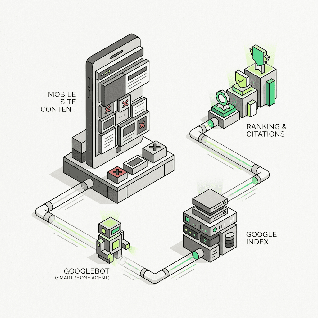
Mobile-first indexing means Google predominantly uses the mobile version of your content for indexing and ranking. Previously, the index primarily used the desktop version of a page's content when evaluating its relevance to a user's query. Now, Google's smartphone agent crawls your mobile experience first, and that becomes the canonical version in their index.
This shift reflects user behavior. Mobile devices now account for approximately 60% of all web traffic, and that percentage continues to climb. Google's mobile-first indexing acknowledges this reality by prioritizing the user experience most people actually encounter.
But here's where many site owners stumble: mobile-first doesn't mean mobile-only. Desktop experiences still matter for desktop users. The critical requirement is ensuring your mobile site contains the same content, schema markup, metadata, and internal linking as your desktop counterpart.
Why Mobile SEO Matters More Than Ever
Google's mobile-first indexing creates a deceptively simple mandate: what Google's mobile crawler sees determines how you rank everywhere. This means content that exists only on your desktop site effectively doesn't exist in Google's index.
The consequences manifest in several ways:
Content discrepancies cause the most obvious problems. If your mobile site hides content in unexpanded accordions that require user interaction to reveal, Google may not index that content. If you've simplified your mobile navigation and removed internal links present on desktop, you've weakened your website's internal linking architecture in Google's eyes.
Schema markup gaps create invisible damage. When your desktop site includes rich Product schema but your mobile version omits it, Google loses the signals needed to display rich results. According to Google's own case studies, websites implementing proper schema have seen 25-82% higher click-through rates compared to non-enhanced listings.
Metadata inconsistencies confuse search engines. Different title tags or meta descriptions between mobile and desktop versions create conflicting signals about what your page actually covers.
The modern search dimension amplifies these issues exponentially. Search systems increasingly rely on mobile-first data sources. When assistants on smartphones—which represent a massive and growing share of search engine traffic—query information, they're pulling from the same mobile-first index. Broken schema, missing content, or mobile-only blocks don't just hurt your Google rankings; they eliminate you from citations entirely. For organizations seeking to future-proof their approach, integrating ai workflow automation for growth is critical.
The Three Paths to Mobile-Friendly Design
Before diving into requirements, it's worth understanding the three main approaches to mobile-friendly sites, as each has different implications for Google's mobile-first indexing:
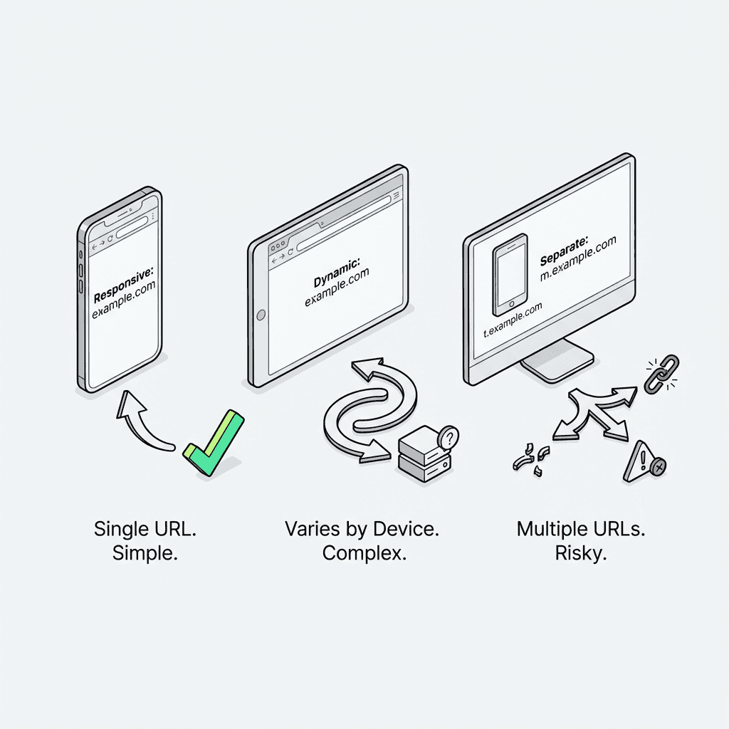
Responsive Design SEO (Recommended)
Responsive design serves identical HTML on the same URL regardless of device, using CSS media queries to adapt the layout to different screen sizes. Google strongly recommends this approach because it's the simplest to implement and maintain, and consistency is essentially guaranteed—you can't have different content when you're serving the same HTML.
From an SEO perspective, responsive design eliminates entire categories of mobile-first indexing problems. You don't need to worry about maintaining duplicate content across two versions, managing separate URL structures, or ensuring schema consistency.
Dynamic Serving
Dynamic serving uses the same URL but serves different HTML based on user-agent detection. This approach requires the `Vary: User-Agent` HTTP header to tell caches that the content changes based on the requesting device.
While functional, dynamic serving introduces complexity. You must maintain two versions of each page and ensure perfect consistency between them. User-agent detection can also fail, potentially serving the wrong version to crawlers or users.
Separate URLs (m.example.com)
Separate mobile URLs serve different HTML on different URLs (typically a subdomain like m.example.com). This configuration requires bidirectional rel=alternate and rel=canonical annotations to help Google understand the relationship between versions.
This approach carries the highest risk for mobile-first indexing issues. Maintaining perfect consistency across two separate sites requires rigorous processes, and any divergence creates indexing problems. Google must also spend crawl budget on two versions of every page.
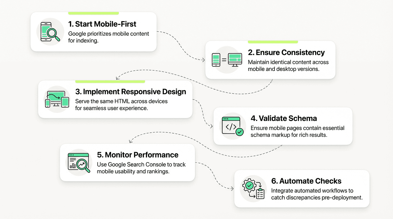
The Mobile Indexing Checklist: Ensuring Complete Consistency
Achieving mobile-first indexing success requires systematic attention to multiple dimensions. Here's your comprehensive mobile indexing checklist, which many teams now automate with an ai workflow builder:
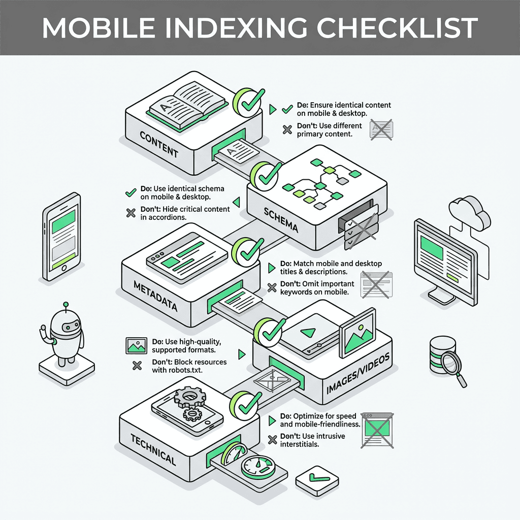
Content Consistency
Your mobile site must contain the same primary content as your desktop site. This seems obvious, but implementation details matter:
Full text content: Don't truncate articles or hide paragraphs behind "read more" buttons that require interaction. Google won't trigger these interactions.
Headings and structure: Use the same clear, meaningful headings (H1, H2, H3) on mobile as desktop. These provide crucial semantic signals.
Internal links: Maintain the same internal linking structure. Links removed from mobile navigation harm your site's crawlability and PageRank distribution.
Expandable content: If you use accordions or tabs for mobile UX, ensure the content is in the DOM on page load, just CSS-hidden. Google can process CSS-hidden content but won't trigger JavaScript events.
Schema Markup on Mobile
Schema markup deserves special attention because its absence on mobile creates silent failures. Your pages may lose rich result eligibility without any obvious error messages.
Ensure identical schema across both versions, with particular priority on:
Breadcrumb markup: Helps Google understand site hierarchy
Product schema: Critical for e-commerce sites seeking rich results
VideoObject markup: Required for video rich results
Article schema: Important for news and blog content
FAQ and HowTo schema: Increasingly important for featured snippets
Use the Rich Results Test on your mobile URLs to validate implementation. Even better, incorporate automated testing into your deployment pipeline to catch regressions before they go live. Adopting ai powered marketing automation can help streamline these ongoing validations.
Metadata Consistency
Your title elements and meta descriptions must be equivalent across versions. While Google may rewrite these anyway, inconsistency creates confusion about your page's topic and purpose.
Also verify:
Canonical tags: Point to the correct URL for your configuration
Hreflang tags: If you have international versions, ensure mobile pages include proper hreflang annotations
Robots meta tags: Using `noindex` on mobile but not desktop is a common catastrophic error
Visual Content Optimization
Images and videos require special attention for mobile-first indexing:
Image best practices:
Use high-quality images, not low-resolution mobile-only versions
Implement identical alt text on mobile and desktop
Use supported formats (JPEG, PNG, WebP, SVG)
Avoid URLs that change on each page load
Set explicit width and height attributes to prevent layout shifts
Video considerations:
Don't use constantly-changing video URLs
Include the same video metadata on mobile
Ensure videos aren't blocked by robots.txt
Use supported formats and proper VideoObject schema
Technical Infrastructure
Several technical elements can sabotage mobile-first indexing:
Robots.txt: Ensure mobile resources aren't blocked
Page speed: Mobile performance directly impacts rankings
Viewport meta tag: Include ``
Intrusive interstitials: Avoid pop-ups that block content access on mobile
Ad placement: Follow the Better Ads Standard; ads shouldn't dominate mobile viewports
Validating Mobile Consistency with Search Console
Google Search Console's URL Inspection tool is your primary weapon for validating mobile-first indexing readiness. Here's how to use it effectively:
Inspect mobile URLs: Enter your mobile URL (or desktop URL if using responsive design)
View crawled page: Click "View crawled page" to see exactly what Googlebot rendered
Compare screenshots: Check both the screenshot and the HTML to identify discrepancies
Review schema: Verify all expected schema appears in the mobile version
Check coverage: Look for indexing issues or warnings
Pay special attention to the user-agent shown in the inspection results. Google Search Console should show Googlebot crawling with the smartphone agent (Googlebot Smartphone) for mobile-first indexed sites.
Modern Search Optimization: The New Frontier of Mobile Consistency
Traditional Google rankings represent only half the story. Modern search systems have fundamentally changed how users discover and consume information, and these systems are overwhelmingly mobile-first.
Consider the user journey: Someone asks Siri or Google Assistant a question on their iPhone. That query gets processed by a system that pulls from the same mobile-first index Google uses. If your mobile version has:
Less comprehensive content than desktop
Missing or broken schema
Incomplete metadata
Poorly optimized images without alt text
...then you're invisible to citations, regardless of how well-optimized your desktop site might be.
This represents a crucial evolution: mobile consistency is now a search requirement, not just a Google checkbox. The same content gaps that hurt your traditional rankings also eliminate you from ChatGPT citations, Perplexity answers, and Google SGE results.
Voice search amplifies this further. Voice queries are predominantly mobile, often longer and more conversational than typed searches, and increasingly answered by modern systems rather than traditional blue links. If your mobile experience doesn't provide comprehensive, well-structured content, you're missing the fastest-growing segment of search traffic. Leveraging ai powered workflows can help ensure your content is optimized for both traditional SEO and modern search.
Common Mobile-First Indexing Mistakes
Even experienced SEO practitioners stumble on these frequent issues:

The accordion trap: Hiding content in collapsed accordions or tabs that require clicks to expand. While this improves mobile UX, if the content isn't in the DOM on page load, Google may not index it.
The lazy loading pitfall: Implementing lazy loading for primary content that requires scrolling or interaction to trigger. Google won't simulate these user interactions.
The separate URL disaster: Maintaining separate mobile URLs (m.site.com) but failing to implement proper rel=alternate/canonical annotations or allowing content drift between versions.
The dynamic serving complexity: Using user-agent detection to serve different HTML but forgetting the `Vary: User-Agent` header, causing caching issues and inconsistent experiences.
The schema gap: Implementing rich schema on desktop but omitting it from mobile, losing rich result eligibility.
The mobile-first mindset failure: Treating mobile as a simplified version of desktop rather than the primary version Google indexes.
Implementing an Automated Consistency-Check Workflow
For growth teams managing multiple sites or frequent deployments, manual consistency checks become unsustainable. This is where automation becomes critical.
An agent-based consistency-check flow can systematically validate mobile-desktop alignment on every deploy:
Render pages in both viewports: Capture mobile (375px) and desktop (1920px) viewports
Extract and compare content: Diff the main content, headings, and internal links
Validate schema markup: Parse and compare schema.org markup between versions
Check metadata: Verify title tags, meta descriptions, and canonical tags match
Flag discrepancies: Generate actionable reports highlighting consistency issues
Block problematic deploys: Optionally prevent deployment if critical issues are detected
This approach catches regressions before they impact rankings on either traditional search surfaces or citation systems. Rather than discovering problems through ranking drops weeks later, you identify and fix them in your staging environment.
The beauty of a natural language agent builder is that growth teams can design and iterate on these workflows without engineering dependencies. You can experiment with different consistency checks, adjust thresholds, and refine reporting—all in a unified workspace that bridges creative strategy with technical execution. Teams benefit from a no-code ai workflow builder, allowing marketers and SEOs to automate checks without coding skills.
Monitoring Mobile-First Indexing Performance
After implementing mobile consistency, ongoing monitoring ensures you maintain it:
Google Search Console metrics:
Mobile usability reports
Core Web Vitals (mobile vs. desktop)
Coverage issues filtered by mobile
Manual actions or penalties
Ranking tracking:
Monitor mobile vs. desktop rankings separately
Watch for divergence indicating consistency issues
Track featured snippet and rich result appearances
Technical monitoring:
Automated consistency checks on each deployment
Schema validation
Page speed monitoring (mobile-specific)
Crawl error tracking
Visibility tracking:
Monitor citations in ChatGPT, Perplexity, and SGE
Track voice search visibility where possible
Analyze traffic from modern referrers
The Future of Mobile-First Indexing
Mobile-first indexing is already the present, but several trends will shape its evolution:

Integration deepening: As Google's SGE and competitors mature, the line between traditional search and answers will blur. Mobile consistency will increasingly mean answer readiness.
Voice search growth: Voice queries will continue growing, particularly on mobile devices, demanding even more natural, comprehensive content.
Performance emphasis: Core Web Vitals and mobile page speed will carry greater weight as mobile-first indexing matures.
Schema expansion: New schema types and richer markup will become table stakes for visibility in both traditional and powered results.
Mobile-only features: Google may eventually introduce ranking factors that only apply to mobile experiences, further emphasizing mobile as the primary version. Using the best ai tool for growth marketing will be essential for staying ahead of these changes.
Conclusion
Mobile-first indexing represents more than a technical shift in how Google crawls websites. It reflects a fundamental realignment of SEO priorities around the experiences most users actually encounter. With modern search systems amplifying mobile-first data sources, ensuring complete consistency between your mobile and desktop experiences has evolved from a best practice to an existential requirement.
The sites that thrive in this environment treat mobile as the primary version—not a simplified alternative. They maintain rigorous content consistency, implement comprehensive schema on mobile, and automate validation to prevent regressions. They understand that mobile-first indexing isn't just about appeasing Google's algorithm; it's about being discoverable wherever users search, whether through traditional search engines or powered assistants.
By following the mobile indexing checklist outlined here, validating implementations through URL Inspection in Google Search Console, and implementing automated consistency checks in your deployment pipeline, you ensure visibility across all modern search surfaces. The mysterious ranking drops that plague sites with mobile-desktop discrepancies become a non-issue when consistency is baked into your workflow from the start.
Make sure your website's mobile site is optimized for both Googlebot and mobile users. Ensure your site's mobile experience delivers the same quality content, links, and schema as desktop. Test using Google Search Console's URL Inspection tool to verify what Google's crawler sees on your mobile site. Monitor your search results performance across both mobile and desktop to catch any issues early.